This first year project was based around the idea that we create a advertising/ marketing campaign around a shoe brand, but to add the project and give us more freedom also create the identity for the new brand. Which we created as well. We started with the stock and what it would be selling, which was sneakers, and made a couple designs that we could then use to make the branding around.

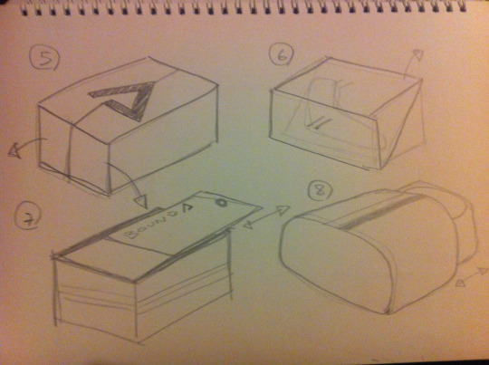
We also designed the packaging to differentiate the brand from other sneaker makers. Leading to the many designs seen below.


The posters and brand identity we thought we more suited to a minimalistic design as the sneakers we more performance based and minimalistic in aesthetics. This led to the posters seen below with the two highlighting the differing nature of the two sneakers. The tagline was also created to try and associate "Bound", the company, to high performance and high achievement. As well as being much easier for consumers to remember.


Below is an advertisement mock-up to see how the branding would work within a magazine context. As well as testing out other design elements and features.


Above is our final assignment showcase that shows our final designs and also design process, which can be seen on my blog here. Below is my vernissage project which was to take an existing project and develop/work on it to a higher standard. I chose to create an sneaker customizer that would allow consumers to change the colour combo of the sneaker to whatever they wanted. I used processing (java) for this and the final program allowed any RGB colour on any part of the shoe with any combo of colours available. It also allowed for the users to then screenshot the creation when finished. This was built with the idea that it would then be available to use on a Bound website, which was at the time being made by my partner in this project.


